
Design the Newsletter Like a Room
Use a clear grid, generous white space, and one hero image to guide the eye. Keep copy blocks short, add subheads as wayfinding. Make buttons large and intentional. Ask readers whether a one-column or two-column layout feels more relaxing on their phone.
Design the Newsletter Like a Room
Choose one elegant serif paired with a functional sans, echoing your brand palette. Reserve accent color for links and CTAs. Reference tactile materials—linen, travertine—through photography rather than noisy backgrounds. Encourage replies with favorite design fonts they’ve seen done beautifully.
Design the Newsletter Like a Room
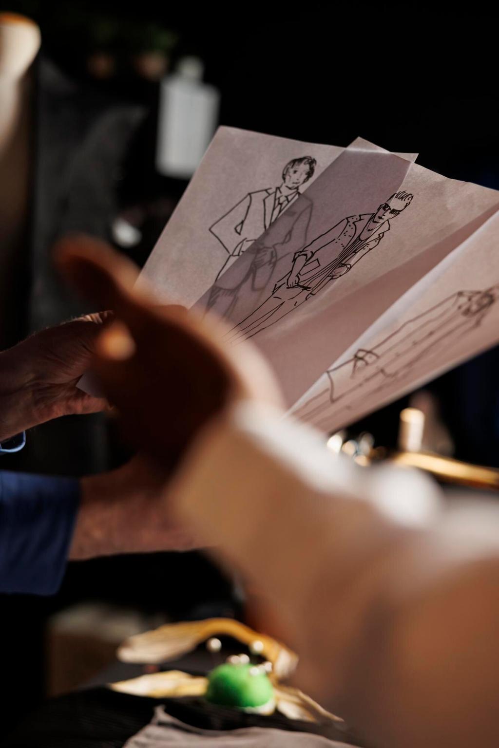
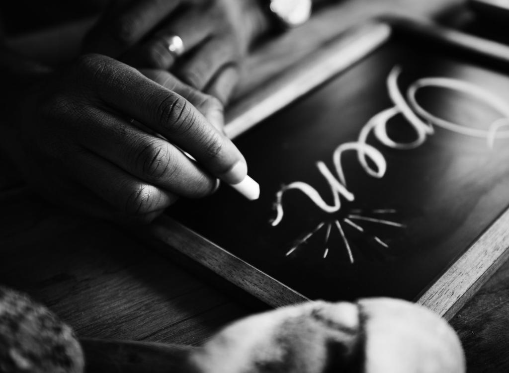
Show fewer images, larger and crisper, with consistent lighting and straight horizons. Compress responsibly, name files clearly, and write descriptive alt-text. Prompt readers to click a detail zoom, then ask what texture or joinery detail they noticed first and why it resonated.